Editor
The Editor consists of five unique areas:
Display Area
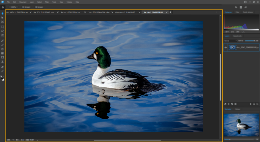
The Display Area occupies the large central portion of the Editor and is where images are displayed. The image residing in the Display Area will change in appearance to reflect edits made though Gemstone filters and tools.
The open image file name is displayed in the image's tab, located left-justified above the image.
Each image tab has a right-click menu as described below.
Image Tab Right-Click Options
| Save | Saves the image as a .gsd file in the ACDSee database without the ability to edit the file name. |
| Save As... |
Opens the Save Image As dialog. Saves a copy of a developed image with a new name or format. Saves a copy of an edited image with a new name or format. Depending on the file type, any of the following checkboxes appear in the bottom left corner of the Save Image As dialog box:
|
| Close | Closes the current tab with a Save prompt. |
| Close All | Closes all images with a Save prompt. |
| Close All Unmodified | Closes all unmodified images without a saving prompt. |
| Close All But This | Except for the current tab, closes all images without a saving prompt. |
| New Document... | Opens the New Image dialog for setting a new document's parameters. |
| Open Document... | Opens the Open dialog for selecting existing images to open in ACDSee Gemstone |
| Reveal In Explorer... | Opens the file's storage location in an instance of Explorer. |
To open another image from an open image:
- Click the plus icon to open the New Document dialog.

- Make a selection from the four tabs in the left hand section of the dialog: Photo, Web, Paper, and Custom.
- In the Create a New File pane, do one of the following:
- Use the default parameters,
- Select a preset, or
- Customize the image properties.
- Click the Open button to open a new image in a new Display Area tab.
To create a new blank image follow the above steps but click the Create button in Step 4.
| Presets | |
|
Presets |
Leave the Presets drop-down list set to "Default" to keep all of the settings applied to the Image field set. Or, select a preset from the drop-down list to accept a customized set of image parameters. |
|
|
Opens the New Preset dialog. Enter a name for the preset, then click the OK button to populate the new preset into the Preset drop-down list. The new preset will be constructed of the parameters set in the Image field set. It is recommended to complete any customizations in the Image field set before completing the New Preset dialog. |
|
|
Deletes a preset from the Preset drop-down list. |
| Image Field Set | |
|
Width |
Enter a value to determine the image width. |
|
Height |
Enter a value to determine the image height. |
|
Unit |
Make a selection from the drop-down menu to determine the unit of measurement for both the Width and Height fields. Options include: "Centimeters", "Inches", and "Pixels". |
|
Orientation |
Click the appropriate icon to specify the image's orientation, either Portrait or Landscape. |
|
Resolution |
Specifies the Dots Per Inch (DPI) of the image. The higher the DPI the better the image quality and the bigger the image's file size. |
|
Color Mode |
Specifies the image's color mode. Options include: "32-bit RGBA" and "64-bit RGBA". The higher the bit count the better the image quality and the bigger the image's file size. |
| Background Content | Make a selection from the drop-down menu to determine the composition of the image's background. Options include: "Black", "Custom", "Transparent", and "White". Another method for setting the background content is to use a Color Picker. |
To change the Display Area tooltip type:
- In the Editor, select Tools | Options... from the main menu.
- In the Options dialog, select Display from the left pane.
- In the Display pane, navigate to the Tab Tooltips field set.
- Enable one of the following to change the tooltip type:
- File Name: No tooltip is displayed.
- File Location: The tooltip displays the file location.
- File Name: No tooltip is displayed.
- Click the OK button.
Toolbar
Located to the left of the Display Area, the Toolbar contains:
- The Home Screen toggle,
- All of Gemstone's editing, movement, and selection tools, and
- The Foreground/Background color toggle.
Home Screen Toggle
Located at the top of the Toolbar, the Home Screen toggle flips between the image's Editor screen and the Home Screen. The Home Screen carries the same functionality as the New Document dialog, documented above.
Editing, Movement, and Selection Tools
The editing, movement, and selection tools, and their associated Tool Property fields, are documented in the Toolbar and Tool Properties bar section.
Foreground/Background Color Toggle
The Foreground/Background color toggle is located at the bottom of the Toolbar and consists of three components:
- Reset Colors,
- Swap Colors, and
- Color Pickers.
Foreground/Background Color Toggle Components

|
Reset Colors | Resets the foreground and background colors to their defaults. Black is the foreground color default. White is the background color default. |

|
Swap Colors | Replaces the background color with the foreground color. |

|
Color Picker | Click the foreground square to open the Foreground Color picker. Click the background square to open the Background Color picker. In either dialog, select a color from either the Standard or Custom tab, or click the Select... button to use an eyedropper to pick a color from an open image. |
Tool Properties Bar
The bar directly above the Display Area is referred to as the Tool Properties bar and is dynamically populated with the editable fields associated with the tool selected in the toolbar. The Tool Property fields for each tool are documented in the Toolbar and Tool Properties bar section.
Menu Bar
The menu bar is a horizontal bar located at the top of the screen that contains drop-down menus for Gemstone's functionality.
The menu bar is populated with the following menu headings:
Editing Pane
The Editing pane consists of four unique sections:
Undo/Redo Settings Bar
The Undo/Redo Settings bar sits atop the Editing pane and consists of three icons:
- Undo icon,
- History Window icon, and
- Redo icon.
Undo/Redo Settings Icons

|
Undo | Click to remove the last change made to the image. There are no restrictions on the number of Undo clicks. |

|
History Window | Click to open the History Window. Use the Undo All button to clear the image's history. |
|
Redo | Adds back into the image the changes from the most recent undo. |
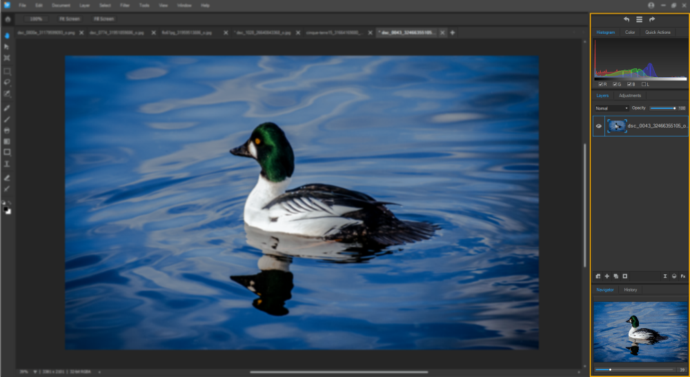
Histogram/Color/Quick Actions Pane
The Histogram/Color/Quick Actions pane resides below the Undo/Redo Settings pane and above the Layers/Adjustments pane and consists of three tabs:
- Histogram tab,
- Color tab, and
- Quick Actions tab.
Histogram Tab
A histogram is a graph that represents the distribution of color intensity for each color channel in an image. Histograms provides a graphical representation of the intensity level of pixels within each color channel. Spikes at either end of the graph indicate clipped colors. Keeping the histogram open is particularly useful when adjusting exposure, as the histogram reflects all recent adjustments.
To display and use the histogram:
- Select Windows | Histogram from the main menu.
- In the Histogram tab, enable or disable the following checkboxes:
- R: Shows or hides the red color channel.
- G: Shows or hides the green color channel.
- B: Shows or hides the blue color channel.
- L: Shows or hides the lightness of the image.
Color Tab
The Color tab consists of a color selection tool that can be used to select color values. Use the slider to change the color type and move the selector within the color window to select a color.
To use the color selection tool:
- With any of the drawing tools selected in the toolbar, adjust the color slider in the Color tab to find the desired color group.
- Fine tune the color selection by moving cursor in the adjacent color window.
- Use the drawing tool to see the selected color applied to the image.
Quick Actions Tab
The Quick Actions tab contains pre-built tools for performing common tasks with one click. The Quick Action options are described below.
Quick Actions Tab Options
| Remove Background | Click to isolate the subject in a mask and remove the background. The subject is not selected. |
| Select Subject | Click to select the subject and maintain the background. |
| Blur Background | Click to blur the background. The subject is not selected. |
| Black and White Background | Click to change a colored background to a black and white background. The subject is not selected. |
Layers/Adjustment Pane
The Layers/Adjustment pane resides below the Histogram/Color pane and above the History pane and consists of two tabs:
- the Layers tab, and
- the Adjustments tab.
Navigator and History Pane
The Navigator and History pane consists of two tabs:
- Navigator tab, and
- History tab.
Navigator Tab
The Navigator tab displays the zoomed portion of the image in relation to the entire original image. If the image is not zoomed, only the original image appears in the Navigator tab. If the image is zoomed, a marquee highlights the zoomed portion.
To perform a zoom operation in the Navigator tab, move the slider below the image to the right to zoom in, and to the left to zoom out, or enter a numeric value in the adjacent field for a more precise level of zoom.
Navigator Tab Right-Click Options
| Floating | Allows the Navigator tab to float in a separate window. |
| Docking | Attaches a floating Navigator tab back into the Editing pane. |
| Hide | Removes the Navigator tab from view. To return the Navigator tab to the Editing pane, select Window | Navigator from the main menu. |
History Tab
The History tab resides at the bottom of the Editing pane and consists of a list of previous actions performed on the image. Double-click a History tab list item to delete it from the list.
The History tab can be used to view the sequence of changes made to the image. The History tab can also be used to jump around in the editing sequence and revert back to a previously-applied adjustment. For example, if a series of adjustments were applied to an image, such as color adjustments, followed by sharpening, and exposure tweaking, revert back several steps to the state the photo was in with just the color adjustment by using the History tab.
To display the History tab in the Editing pane, select Window | History from the main menu.
To return to a specific adjustment, select the desired adjustment in the pane and double-click it. Or select Undo All to undo all of the adjustments.
The Histogram/Color pane, the Layers/Adjustments pane, and the Navigator and History pane can all be docked and undocked from the Editing Pane.